Wednesday, November 30, 2011

sketch support 2012


It has been so much fun to be a part of the Sketch Support Creative Team for the past six months. Earlier today, Allison Davis (Sketch Support) announced the new team for 2012 and I am thrilled to be chosen for the team for another year! Congratulations to everyone on the new team!

Returning Members
Carolyn Wolff
Christine Chain (me!)
Christy Arthur
Janette Kincaid
Jennifer Larson
Jill Sarginson
Katrina Hunt
Lynette Jacobs
Megan Bickers
Melissa Bell
Noey Hunt
Shari Thurman
Suzanna Lee
New Members
Andrea Friebus
Ashley Horton
Cherie Nymeyer
Michele Edwards
Penny Grimsley
Sue Althouse
Virginia Nebel

Monday, November 28, 2011

two page sketch | at apple hill


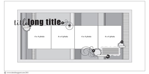
This is from a couple of weeks ago at Sketch Support!
11-04-two-page(NOV)

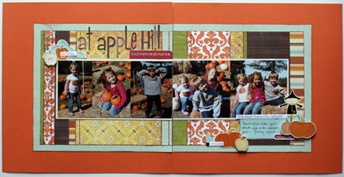
Here’s my take on the sketch:

51-at-apple-hill

Supplies – patterned paper: Echo Park, American Crafts, Imaginesce, Authentique; letter stickers: Bella Blvd; stickers: Bella Blvd. & American Crafts; brads: Lush by My Mind’s Eye; ink: Tsukineko; other: pop dots & embroidery floss (supplies from October GTKC)

1) The first change I made was that I included an extra photo.

I always crop, edit, & resize my photos in PSE before I print them. This time I made the height of all  my photos 4” & then I played around until I liked how the fit on a 8”x4” block. Originally I had them arranged differently, so I had my two group photos separated. Then I realized that if I wanted one of my kids to be in the center photo, I was going to have to cut their face in half to have their photo on two pages. That’s why I love playing in PSE first!

2) I used these pumpkin & apple stickers from American Crafts instead of a flower up near my title. I layered a phrase sticker from Bella Blvd on top. I added the cloud behind them because I thought a little blue would help the colors pop.
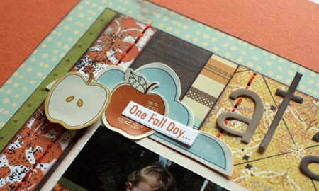
51-at-apple-hill-3

3) Again I swapped out the flowers (and used more pumpkins, apples, and a scarecrow). I used a few more phrase stickers from Bella Blvd…I’m so glad I got these! The phrases were perfect for this layout! I also omitted the swirls. My paper & pictures were busy enough & I think the swirls, as pretty as they are, would’ve been too much on this layout.
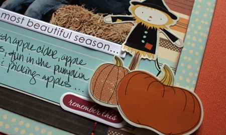
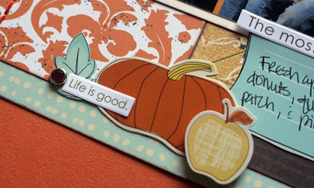
51-at-apple-hill-1

51-at-apple-hill-2

Saturday, November 26, 2011

december 2011 | project 12


Okay, it’s from almost a year ago, but I got it done before THIS December!

I created this layout using this sketch for Project 12 at Scrapbook & Cards Today. It was my first layout as part of the Green Tangerines Design Team.

My challenge was to use lots of fun products from the Basic Grey Jovial line.

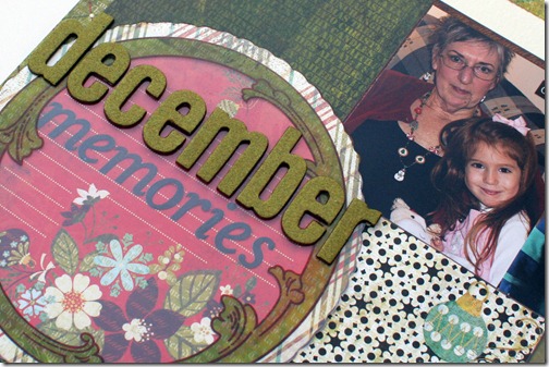
58-December-memories-2010

Supplies – patterned paper, journaling sheet & overlay, rub-ons: Basic Grey Jovial; letter stickers: Basic Grey Jovial & Lush by My Mind’s Eye; ink: Tsukineko; word stickers: Authentique


1) I used this fun journaling block/overlay for the title block. I put the smaller Basic Grey letters directly on the journaling block, covered it with the overlay, and then added the flocked letter stickers on top. I like how it slightly muted the black letter stickers. I also inked the chipboard edges of the letter stickers to help the stand out a bit more.

58-December-memories-2010-1


2) You can see how I inked the letters here too.

58-December-memories-2010-2


3) I added some word stickers around the page. I didn’t do any journaling this time; could’ve. Probably should’ve. But couldn’t find a good way to add it in. And sometimes, frankly, I just don’t want to write, lol!

58-December-memories-2010-3

Friday, November 25, 2011

sketch support | autumn splendor

It’s one page week again on Sketch Support!

You can download and print this sketch by clicking on the one-page sketches link found under the "printable sketches" tab on the right sidebar on the Sketch Support website.

I really stuck to the sketch this week! I finally scrapped photos from our family photo shoot in 2009!

autumn-splendor

Supplies – patterned paper: My Mind’s Eye, Little Yellow Bicycle, Simple Stories; letter stickers: Lush by My Mind’s Eye, American Crafts; word stickers: Authentique; paper leaves: Amy Tangerine by American Crafts; ink: Tsukineko; other: embroidery floss (all from Green Tangerines Kit Club November)

1) I used this cute strip of owl paper for my journaling block.autumn-splendor-1

2) Word stickers came in handy for the journaling strips…I love these!

autumn-splendor-2

Wednesday, November 23, 2011

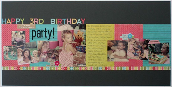
happy 3rd birthday


happy-3rd-birthday

Supplies – (all from Green Tangerines Kit Club September) patterned paper: Crate Paper, Fancy Pants, We R Memory Keepers; letter stickers: American Crafts, October Afternoon; word stickers: October Afternoon; chipboard flowers: Pebbles

I had fun putting this layout together using more supplies from my September Green Tangerines Kit Club. Today was the last day to (re)apply for the Sketch Support Creative Team, which of course I realized late last night! I had two of the three projects ready to go, but not this one. Fortunately I had printed the photos a couple of weeks ago, so I just had to figure out what paper/s & embellishments I was going to use. The colors of the paper I had on hand worked for me, so even though this was definitely a “last minute” layout, I’m pretty pleased!

Wednesday, November 2, 2011

say cheese!


I was just going thru some of my drafts on here & realized I had a post or two I hadn’t shared…

This card is based on the add-on sketch #9 on Sketch Support. You can find the sketch here.

Sept-add-on-1

supplies: patterned paper: Crate Paper, October Afternoon, & Bo Bunny; letter stickers: Echo Park; ribbon paper: Basic Grey; punches: Stampin’ Up!; other: ink, pop dots, ribbon from my June Green Tangerine’s kit club; card sketch # 7 from Sketch Support

As soon as I saw this sketch I thought it would be fun to put on a card. I altered the dimensions of the camera slightly; I printed out the sketch on a regular sheet of paper, and liked that size, so I used those dimensions (it’s now 3”x2”, roughly). I’m glad I made it a little bigger than the sketch because I think this size works nicely on a 4 1/4” x 5 1/2” card.

Once I made the camera, I needed to come up with a card design to put it on, so I went thru the card sketches at Sketch Support & came across this one, which I thought would work nicely. I moved the sentiment to the “open” space on the lower right because it looked off-balance below the camera.

I Sept-add-on-2