Friday, April 27, 2012

sketch support | easter


It’s one-page week at Sketch Support again. Head on over there to get a free copy of this week’s sketch & check out what the rest of the creative team came up with.


07-easter

Supplies – patterned paper: Crate Paper, Jillibean Soup; embellishments: Jillibean Soup; ink: Tsukinenko

Variation #1: I changed the size of the 4x6 photo to so I could use my square Instagram photo.

Variation #2: I enlarged the journaling block area so I could include the bottom 3/4 of 3”x4” journaling tag from Jillibean Soup.

07-easter-2

Variation #3: I didn’t use any hearts…I used a few different punch-outs from Jillibean layered with stickers to accent my photos.

07-easter-1

07-easter-3

week in the life 2012 | thursday


No I didn’t do this last night…I slacked! Brain dead after a crazy day at work, baseball, errands, and just being a mom. So I watched “The Sopranos” with the hubs & then went to bed early. And yes, I know “The Sopranos” hasn’t been on for a few years. We just recently started watching it & we’re into season 3 now (I think).

And now here is my Thursday in photos:

Untitled-1IMG_0987IMG_0992IMG_0995IMG_0996IMG_0999IMG_1002IMG_1011IMG_1014

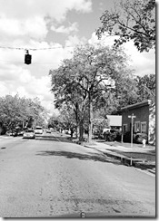
I added a few word stickers to my photos (including one that says “main street” to the street shot…my drive down Main St. in Roseville every day to & from work!).

Wednesday, April 25, 2012

week in the life 2012 | wednesday


Three days in & I’m still going!

ae_weekinthelife2012_120x240promo[1]

My goals for this year?

1) Be in at least one picture per day.

2) Work on it every night.

3) Be complete by the end of this week.

Looking good so far!

Today I’m just going to share my photos, not in the page protectors. I hate the big glare I have to get by using a flash (or the stupid shadows I get when I go without). I plan on sharing the entire spread/album/whatever-you-call-it when it’s all complete. And since I’m printing at home, that should be next Monday! I don’t think I’ve ever been so on top of things (it must be because I should be writing reports right now, and this is a great way to procrastinate!).

So here are my photos from today:

Untitled-2IMG_0957IMG_0964IMG_0958IMG_0962IMG_0960IMG_0975IMG_0966reading

Wow! I didn’t plan for my photos to line up like they were in a protector! How cool is that?! I will probably be adding a few sticker labels/words. And I plan on printing my date tab on some more patterned paper. But otherwise, there is my daily layout :)

Tuesday, April 24, 2012

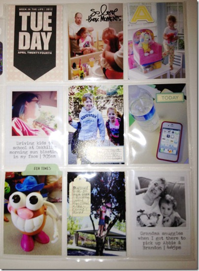
week in the life 2012 | tuesday

Now two days in…I wasn’t sure if I’d end up with enough photos today, and then pleasantly surprised to see I had too many! I’m not taking the same crazy amount I have in the past for Week in the Life—and that’s okay—but I almost feel like I could’ve done the whole album.

Almost.

So without further ado, day 2:

WIL-2tues

(Taken with my phone at 10pm. So my apologies for the crappy photo.)

Again I printed my “title” for the day using this kit from Ali Edwards on a sheet of patterned paper. I tried to get creative in PSE last night & then gave up. It’s just so easy to print black on patterned paper. (And it was time for me to get back to IEP report writing!)

I added a few sentiments in PSE, and a few label stickers (October Afternoon & Jillibean Soup). Today I also included two Instagram photos (I seriously love that app!). I opened them up in PSE, dropped them onto a sheet of grid patterned paper (cropped to 2.5” x 3.5”), added a drop shadow (thanks Design Editor for that idea!), and voila! Finally I added a bit of journaling and then I was done!

On a side note…yesterday I received a comment about how I’d actually printed my photos already…this is a rarity for me! I have a “photo” printer but I rarely print at home. However, I liked that I could complete each daily layout that day while working on December Daily a few months ago. So I decided to use up some 4”x6'” photo paper I’ve had sitting around. I find with projects like this (and DD), if I don’t do it every day, I don’t do it at all. Like my Week in the Life from last summer that is still just hundreds of photos in a file on my computer and a box of memorabilia.

Monday, April 23, 2012

week in the life 2012 | monday

Because I need another project like I need a hole in the head…

But I digress Smile

I participated in Week in the Life for the first time 2 years ago. Check out what I did here.

Last summer I participated again. I still have to put that album together.

So when Ali Edwards shared that it was “that time” again, well, I thought I would sit out this time. Until this morning when I saw how Elise was doing her Week in the Life. And I thought, “I can totally take 9 pictures a day & add them to a baseball card holder!” And then I did it.

WIL-1mon

And so far, I’m so glad I did.

(Please excuse the poor lighting & the flash. I took this with my phone at 11pm)

Monday, April 16, 2012

winners!


After our blog hop on Saturday I've got a few winners to announce!

The winner of "Sketches for Scrapbooking One Page Sketches, vol. 2" is:

SS winner 1

The winner of “Sketches for Scrapbooking: Travel Photos” is:

SS winner 2

Both of you can email me at christinechain19@gmail.com with your shipping information and I'll get those prizes sent out to you.

Thank you to everyone who participated in the blog hop! I hope you all had a wonderful time!

Saturday, April 14, 2012

sketch support blog hop | let’s party


*If you are just starting at my blog, make sure you begin at the Sketch Support blog to begin the hop!
Welcome to the blog hop to get to know the design team for Sketch Support! My name is Christine Chain. I am a preschool-based speech-language pathologist, wife, and mother of three--Brandon (7), Olivia (6 in a week!), and Abbie (3 1/2).

The hop is running today, April 14. If you leave a comment on each blog, you get a chance at some individual prizes on each blog, as well as a chance at another prize from Sketch Support!
In addition to many chances at prizes, I hope you enjoy going from blog to blog, seeing the wonderful takes on this sketch:

09 june basic sketch

*If you want a downloadable version of the sketch, please get it at Sketch Support.
Here’s my take on the sketch:

03-let's-party

Supplies – patterned paper: Jillibean Soup, Fancy Pants; letter stickers: Thickers by American Crafts, My Little Shoebox; tags & buttons: American Crafts; ink: Tim Holtz’ Distress Ink by Ranger

I really liked this sketch & was glad that I got to scrap some pics from my son’s birthday party in February. I kept the photos & paper pieces the same sizes as in the sketch, but I did make a few variations.

03-let's-party-1

1) I decided to use journaling strips. Mostly because I had adhered the paper & photos & then realized I still needed to write something! I could’ve just hand written it, but I didn’t want that look on this layout.

I also changed the arrow to another strip of paper & a button. I didn’t have any arrows and didn’t like the ones I tried to make. So I grabbed a pack of fun buttons that went with the paper I was already using.

03-let's-party-2

2) Again, I didn’t use arrows. This time I thought I needed something bigger, so I used two tags; one on top vertically, and one underneath horizontally.

03-let's-party-3

3) I forgot the title was supposed to go across the photo until after I printed it. I totally could’ve cropped it differently, but thankfully I could still fit what I wanted to say above the photo. I still have two lines & I love how it turned out!
And because this is a “get to know you” blog hop…let’s get to know me!

How long have you been scrapbooking? I’ve been “scrapbooking” (as we all know it) since sometime in late 1999. However, I’ve been cropping photos, trying to organize them in albums (yes, the old “magnetic” ones!), labeling them, and adding stickers & other tid-bits since probably 7th grade…back in 1989. Wow!

Why did you start scrapbooking? I didn’t like how when you opened my parents’ albums, you didn’t know what you were looking at (besides lots of pictures). They took tons of photos, and had tons of albums, but the only information was the year on the spine of the album. So when I started putting together my own photo albums in 7th grade, I cropped my photos down and used a sharpie on the page so anyone would know what they were seeing. I even added my own little cute titles on each page! As time went on, my pages (and style) evolved into what it is today.

What is your favorite time of day to scrapbook? If I could choose? In the afternoon when my kids are playing in the next room. But I usually don’t get to choose & scrap late at night.

How often do you scrapbook? Only a couple of times a week now. Sad smile Boo! I just went back to work 4 days a week this last August, so between that & three kids…well, I scrap when I can!

Where do you scrapbook/what does your space look like? I have an office, and I have a desk. But that desk has been hidden under a bunch of supplies for a while. I really need to clean it up & reorganize…but I’d rather scrap (or shop!).

When I'm not scrapbooking you can find me...at one of my girls’ dance classes, at my son’s baseball games, or running errands at Target. And generally behind a camera at the same time.

What is your favorite thing about using sketches? I don’t have to think! Ha! My brain is on overload all day long, so when I want to unwind by scrapbooking, I just want to play with my photos & some paper, and know that they will look great when I put them together because I started with a great sketch!

What is your favorite sketch from Sketch Support? Hard to choose! I love them all, but as I went back thru a bunch of my older layouts, this one caught my eye:

35-friday-night

Based on this sketch:


I like that there is a lot patterned paper, a few accents, and a large block of photos that can be resized as needed.

Thank you for visiting my blog! Feel free to scroll around, and please sign up to follow if you want to keep track of my posts. And be sure to leave a comment to get a chance to win one of two “Sketches for Scrapbooking” books! I am giving away Allison Davis’ most recent editions: One-Pages Sketches volume 2 and Travel Sketches.

The contest closes Monday 4/16 at 6pm, PDT.

Wednesday, April 11, 2012

sketch support | disney highlights, 2011


Two page week just wrapped up at Sketch Support, so it’s time to share my layout. Head on over there to get a free copy of this two-page sketch & check out what the rest of the creative team came up with.

I decided to scrap some photos from our vacation last November to Disneyland. I hadn’t done much, other than another layout of the holidays at Disney. I’m planning on making a photo book  on Shutterfly with all of our photos, so I chose to just pick a few highlights. I even had my (almost) six year old daughter help choose photos & come up with her favorites from our vacation for the journaling.

disney-highlights-2011

Supplies – patterned paper: American Crafts, Crate Paper, Echo Park, Jillibean Soup; buttons: Crate Paper; label & letter stickers: Jillibean Soup; ink: Tsukineko; corrugated letters: Jillibean Soup (all from my February Green Tangerines Kit Club)

disney-highlights-3

Variation #1 – I used a cute mini-heart print from Jillibean Soup rather than striped paper. I didn’t have a good stripe to match all the patterned paper I was using, and I liked how this paper coordinated & had a small enough print to work.

disney-highlights-1

Variation #2 – Instead of using labels & a swirl on the far right, I used little letter stickers & a couple of buttons. I was able to write the sentiment I wanted to in the same space without changing the overall design.

disney-highlights-2

Variation #3 – For the title, I kept the embellishments & actual title similar to the sketch by using letter stickers & a button, along with a small label. However, I omitted the actual block behind the title.

Friday, March 30, 2012

sketch support | awesome

It’s one-page week at Sketch Support again. Head on over there to get a free copy of this week’s sketch & check out what the rest of the creative team came up with.

I decided to use a picture taken of my son on his 7th birthday and incorporate an interview with him for my journaling. I used the same questions for him on his 6th birthday (and on Olivia’s 5th last year too). The questions came from Cathy Zielske’s Story Guide Layered Template #1 available here.

04-awesome

Supplies – patterned paper: October Afternoon, Echo Park, Sweet Caroline by My Mind’s Eye, Cosmo Cricket; epoxy paper clip: Sweet Caroline by My Mind’s Eye; letters: Thickers by American Crafts, Authentique; chipboard accents: Bella Blvd; label sticker: Cosmo Cricket; interview questions: from Cathy Zielske’s Story Guide Layered Template #1; ink: Tsukineko; other: embroidery floss

Since you can’t read what he said too well, I thought I’d include his “awesome” answers:

My favorite food is: sushi
My favorite sport to play is: soccer.
The best show on television is: Beyblade Metal Masters.
The coolest person on Earth is: Jack.
My best subject in school is: playing tetherball.
The thing I do the most awesomely is: Bakugan battles.
If I could change my name, it would be: Monsoono.
If I could go anywhere in the world, I’d go to: China.
My favorite color is: green.
When I grow up, I’m going to become a: I don’t know.
The thing my parents are too strict about is: cleaning up my room & not letting me watch shows on TV that I want to watch.
My current favorite band is: LMFAO (I’m Sexy & I Know It).
The last book I read was: Bakugan Ultimate Handbook.
Three words that describe me are: good friend, funny, smart.
When I was little, I used to: ride my bike around the block with my dad.
My favorite season of the year is: summer.
The snack I could live on is: Gushers.
The food that makes me want to puke is: yogurt.
My best friend is: Jack Hutchison.
If I had one wish it would be: to have a whole bunch of toys.
My best memory is: riding CA “SCREAMIN’” with my mom.

Variation #1 – I didn’t use anywhere near as many embellishments! I wanted this layout to be a bit more “clean & simple” since it’s about my son…not that a layout about a boy can’t have embellishments, but I really liked how it looked without much extra.04-awesome-1

Variation #2 – I used a few label & word stickers, plus a “7” (since this is when Brandon turned seven) in place of the flower/button embellishments.04-awesome-2

Sunday, March 18, 2012

sketch support | fun times

Two page week just wrapped up at Sketch Support, so it’s time to share my layout. Head on over there to get a free copy of this two-page sketch & check out what the rest of the creative team came up with.

05-fun-times-in-feb

Supplies - patterned paper: Sweet Caroline by My Mind's Eye, Basic Grey, Echo Park, Cosmo Cricket; letter stickers: Thickers by American Crafts, Authentique; chipboard embellishments: Bella Blvd; journaling spot: My Mind's Eye; ink: Tsukineko

Variation #1: I really toned down most of the embellishments. The patterned paper was busy enough that I didn't want to add too much! I did keep a few of the "label" spots. I also omitted the "word" & just kept my title on the left.

05-fun-times-in-feb-2

Variation #2: For my journaling block, I cut a calendar journaling spot in half (& kept the rest to use later), inked the edges, & overlapped two of the areas.

05-fun-times-in-feb-1

Friday, March 9, 2012

sketch support | happy birthday


A few ladies I work with had birthdays this last weekend, and a few good friends have birthdays this next week…so needless to say it’s time to replenish my birthday card stash!

I love the card sketch featured at Sketch Support this week. Head on over to check out what the rest of the Creative Team came up with, and to grab your own FREE copy of the sketch.


card-sketch

Supplies – patterned paper: My Mind’s Eye, Authentique; paper flowers: unknown, in Green Tangerine’s January kit club; brads: Bo Bunny; fabric letters: American Crafts; ink: Tsukineko; other: embroidery floss

Variation #1 - The most obvious change I made was that I used half of an 8 1/2 x 11 sheet of cardstock to make the card 4 1/4 x 5 1/2. I kept all the other dimensions the same.

Variation #2 - I omitted the swirl & used larger letters for the sentiment. Which makes the title block more of a background than a block, but I like it like that :)

I’m also loving the colors from the GTKC January kit…turquoise, sand, orange, brown…reminds me of the beach…when is summer already?

Friday, February 24, 2012

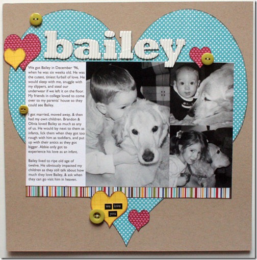
sketch support | bailey


It’s one page sketch week over at Sketch Support. Head on over there to check out this week’s sketch & what the rest of the Creative Team has come up with.

Here’s my take:

17-bailey

Supplies – patterned paper: Bo Bunny, My Mind’s Eye, Bella Blvd; buttons: Basic Grey; corrugated letters: Jillibean Soup; word stickers: Authentique; ink:Tsukineko; other: embroidery floss

As soon as I saw the large heart I knew I wanted to make this layout. I’ve had these photos for over three years, and the idea for almost six. Bailey was a special dog & needed a special layout.

First of all, to get the large heart (& small hearts since I don’t own a heart punch), I went into PSE & drew some hearts. Then I made a few tweaks to the design:

17-bailey-1

Variation #1: I used buttons instead of the smallest hearts. I wanted this layout to be about how much my kids love my parents' dog, but not overly "lovey" with tons of hearts. Bailey was a boy, after all, lol!

17-bailey-2

Variation #2: I omitted the stitching and some of the hearts at the bottom. I ended up liking how it looked just like this (even though I had cut out other hearts & had more buttons). Once I added the word stickers it just felt done.