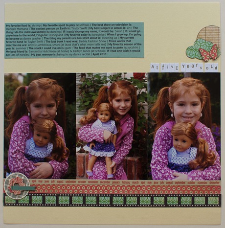
I recently shared an interview I did with Brandon using an interview format from Cathy Zielske. I had originally planned on using that same layout for my interview with Olivia, but then I saw this cute “at three and a half” layout from Susan Weinroth & immediately change my mind and made this:
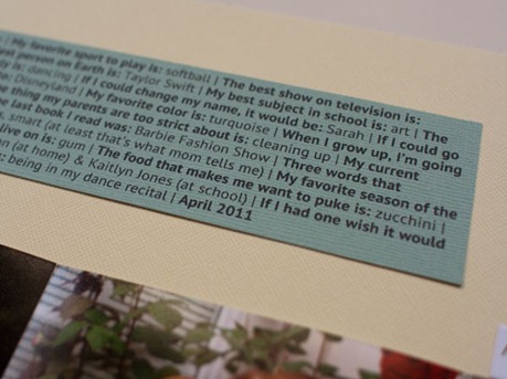
The first thing I did to my layout was take the journaling I’d already typed up from the interview layout and put it in a paragraph form. I kept the questions in bold & answers in regular (using the font PT Sans that was from the digital template). I separated each question with the “|” (it’s the uppercase of the back slash, just above the enter key) and then added the date at the end. I printed it all on some aqua Bazzill that I had leftover from another layout & adhered it to the top of the page.
Then I added my three photos & started to play! I broke out my May GTKC for the first time & had fun picking out prints :)
After my photos were in place, I spelled out “at five years old” with the mini letter stickers, and just above that I added some patterned paper I punched out with my cloud, butterfly, and 1 3/4” circle punch. I inked the edges and adhered them, then added a staple for the butterfly body.
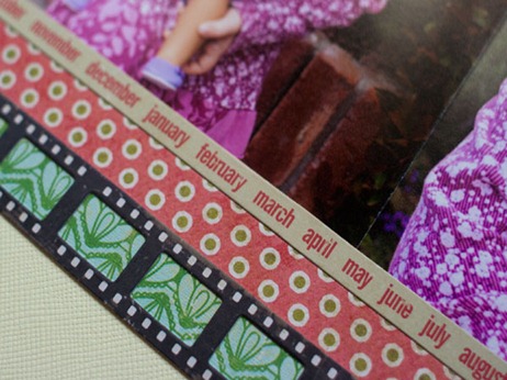
I added those same pattered papers in strips below the photos, and included two border stickers from Crate Paper. I’m very impressed that they were actually 12” long; it seems like so many other border stickers aren’t quite long enough. I love the film strip border sticker! I was going to use it by itself, but it looked so blah without anything behind it.
Something was still missing so I pulled out this cute little custom embellishment from my kit. I love how it’s just a fun funky design & I think it adds that perfect oomph that I needed.


No comments:
Post a Comment