It’s two page week again on the Sketch Support blog! This week Allison is featuring a sketch from her new book Sketches for Scrapbooks vol. 8. You can purchase a copy for yourself here, but you can snag the sketch for FREE here.
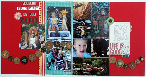
And here is my version:
supplies (all from my Green Tangerines June kit) letter stickers: Lush by My Mind’s Eye, October Afternoon, & Echo Park; chipboard buttons: Graphic 45; Word Stickers: Echo Park; Patterned Paper: Crate Paper; Journaling block & ribbon: unknown; Punch: EK Success; Decorative Brads: Stella Rose by My Mind’s Eye
My original plan was to stick with the sketch & do something for the Fourth of July. And then I went thru my photos & realized I hadn’t scrapped our zoo pictures from April!
The first change I made was to add more photos. The sketch calls for three 4x4 photos stacked on the right page. First of all, I had two photos that just didn’t work as squares. And second of all, I wanted to use a few more pictures. So I opened up a 6x12 block in Photoshop Elements and made a grid of eight 3x3 photos. Then I started playing around & came up with the above photo block.
*Tip: You should be able to see the white lines in between each photo. Instead of trying to line all of them up with a perfect margin & still make it fit, I simply selected each photo layer (before flattening) and went to “edit>stroke (outline) selection”. I outlined each photo with a 10px line that was centered.*
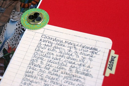
1) As you can see, I didn’t use stars! I had this cute journaling block in my GTKC kit that I was planning on mounting on something. But no matter what I put under it, I liked it by itself more. Plus the block itself kind of stands in for the large star.
2) I substituted these cute buttons for the star border. originally they were just place holder so I could see if I liked the swoosh of stars going over my photo on the right, and then I realized I really liked the buttons. And they have a few clock ones to go with the clock on the journaling block…yay!
After getting the buttons stitched on & my pages almost done, I decided they needed a little extra something. So snipped the legs off of a few brads & glued them down. I love the extra bit of color & bling.
3) Instead of a scalloped border next to striped paper, I used “torn paper” ( have no idea what to call this) punch and some ribbon from my kit. The scalloped edge didn’t fit the look I was going for, and with all the circles I thought the scallops would be too round.
And for those of you who’ve made it this far….
…it’s a giveaway of Sketch Support’s latest sketch book, volume 8.
You can leave me a sweet comment to be entered in a drawing for a free copy of "Sketches for Scrapbooking" volume 8. I will draw a winner (late) Sunday, July 17th and post the winner. And for extra chances, head over to the rest of the Sketch Support Creative Team blogs...we're all giving a copy away this week!


Cute layout as usual! I would love a copy of this!
ReplyDeleteCute layout!!
ReplyDeleteWow...what a wonderful layout!! Thanks for the chance to win :)
ReplyDeleteI love Allison's sketches, but always have to come here to see what you've done with them "in real life" and get inspired. I have all of the books but this one and would love to have it. Thanks for the chance to win!
ReplyDeleteI just love seeing all the super cute GT Kit Club goodies put to good use... Great job! Can't wait to see more!!!
ReplyDeleteVery nice layout. I loved the buttons.
ReplyDelete