Sunday, August 29, 2010

legoland

My detailed Legoland experience can be found here. My scrappable story is here:


For this layout I used a sketch from Becky Higgins. I'm sure it's from her sketch book or Creating Keepsakes, but I found the inspiration on her blog here.

The papers are a mix from American Crafts' Heat Wave line & my Apr/May Green Tangerines kit (have you heard? They're reopening sometime in September! Woo-hoo!). I had fun using lots of bright colors on this layout. And, that cute strip of paper at the top with the diamonds on it? It's the reverse of the paper "edge" that's meant to be torn off (with the line name on it). How cool that AC has made that strip functional! Fortunately I had two sheets of the Kahuna Kiwi paper so I was able to do the strip across both sides of my layout.


Although I didn't ink the edges of everything, I did ink the circles. They just needed a little more definition. Becky didn't have them in her original layout, but mine just lacked "something" so I punched some out with my 3" circle punch, inked them, & slid them into a few spots. Perfect!


For my journaling, I used a sheet of lined paper that I trimmed down to size, and then I punched the edge to make it look like I tore it out of a notebook. I've been seeing this a lot lately, and so I recently picked this border punch up at Michael's (40% off!). I'm having a ton of fun with it!

Tuesday, August 24, 2010

heaven hop

Olivia had her first dance recital this last June. It was at Folsom High School at 4pm on Friday; we left for Disneyland at 5am Saturday! Crazy!

The sketch for this layout came from Allison Davis' sketch book #3. I used Basic Grey's Kioshi paper and some Thickers from my stash.

The butterflys were punched out of more Kioshi paper with the Martha Stewart Classic Butterfly punch I got at Michael's. I had the rhinestones in my stash & I think they made a fun little body; I had wanted to use two different sizes, but I only had a couple small rhinestones (these are the medium ones), and the larger ones were way too big!

Sunday, August 22, 2010

candle making

While in Tahoe this last winter, my mom, sister, & I took the kids to make candles at Waxen Moon in Squaw Valley.

I've used this layout a couple times before, with slightly different photo sizes.


Both patterned papers came in my May Green Tangerine's kit and are from Crate Paper.

The pink paper I used for journaling is actually the reverse of the pink & orange patterned paper that I used on the bottom of the photo block. The font is called Teen & can be found here at dafont.com.

I used these puffy chocolate thickers from my stash.


Thursday, August 19, 2010

flashback friday...rush camp


forgive the scanner line down the middle :)

I can't believe it's been 12 years since this day! After a long weekend of prepping for Rush, we got to go to our chapter advisor's house to go swimming. I have such fond memories of my days in Alpha Phi!

Wednesday, August 18, 2010

splashing in the sprinklers

Our kids had so much fun splashing in the sprinklers at my sister in law's house this last June. And of course I had fun putting this layout together!

I used another Allison Davis sketch. I really like how she uses lots of patterned paper on her layouts, because I'll admit, I never was quite sure what to do with it all!


I found these yellow vinyl thickers on clearance on Two Peas, along with all the paper from American Crafts' Heat Wave line. The fun little letter stickers are Making Memories (?) and are from one of my GT kits from last summer.

The "flowers" (that look like a cross between flowers & sea shells) are from that line too! I simply pierced them & added a white mini-brad. You can really tell here, but they're semi-glittery too.

***Photo note: This time I took the pictures in the very sunny playroom, but not in direct light. And I took them in RAW mode so I could adjust the exposure & white balance. That's what I do with my regular photos, so it's not a big deal. I was just trying to be quick with my layout photos. Anyhow, I think I've got it down...kind of!***


Tuesday, August 17, 2010

party in the usa

Not anything too fancy for my 4th of July layout this year, oh well...sometimes it's nice to have something simple :)

Monday, August 16, 2010

fathers' day

I really had fun doing this layout! I used a Becky Fleck sketch from Page Maps & changed it just a little bit. But the photo sizes are about the same.

For this layout I used a bunch of goodies from my April/May Green Tangerines kit (lots of October Afternoon Fly A Kite!), along with some Thickers & October Afternoon letter stickers from my stash.

The flower paper here is actually a journaling card that I cut down to the right size. It was fun to add some of these in along with the patterned paper.

Another journaling card, but this time I added some word stickers too. Love the little mini-banner on this one!

I overlapped the letter stickers here so they would fit on the journaling card trimmed down. I love the journaling cards & have fun figuring out new uses for them.

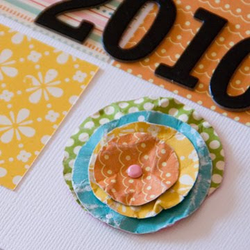
I made this flower by punching out circles in different sizes. Then I wet them, crinkled them up, and opened them back up to dry flat. Once they were dry, I layered them & put them together with a pink mini brad. This is basically the same technique I used on this layout here.

Friday, August 13, 2010

this just screams summer

As soon as I saw this photo of Olivia I thought, SUMMER!


So I set it aside & knew I'd scrap it at some point.

Then I came across this contest on the Page Maps blog, and thought, hey, I know what I'm going to do now! And came up with this:

I really had fun with this one. I used a bunch of October Afternoon Cherry Hill from my stash.

The scalloped circle "newsprint" (or dictionary excerpt I guess) was the patterned paper side of a journaling card. My scallop punch is 3" diameter, and of course the card is vertical (& only 2.5" wide). The journaling card to the right (with the title on it) covers up the circle that isn't.


Another scalloped circle made from a scrap. This circle is only as big as what shows; there is nothing hidden under the tan paper.

flashback friday...american river rafting

I can't believe this was 13 years ago! My best friend Lori & I decided to go rafting on the American River, so we drove up here with a cooler full of ice & beer. And I mean full. Because we didn't think about the fact we'd have to haul that cooler from the trunk of my car on Gold Country all the way down to the river!

In case you were wondering, we got those awesome hats the night before at Lucky's. We were SO awesome! We had a great time that day, and both got totally sunburnt.

Thursday, August 12, 2010

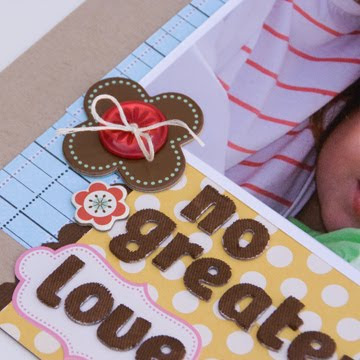
no greater love


I love this picture of Olivia & her great-grandma Mary. I could've done a layout of just that, but I like a few of the other photos too (like of them kissing). So I created the layout above, all from items I had sitting around waiting to be used! Yay!

I wasn't sure what I wanted to do with the photos, but found a cute sketch in an e-zine from Ella Publishing. The sample layout used a bunch of the papers seen here, and I was like, "hey, I have that stuff! I can use that idea!" So I did.

The blue paper is Sassafras from an old kit. The yellow is Cosmo Cricket, and also from an old kit. The flowers are Cosmo Cricket chipboard stickers that were purchased for another layout. The letters are actually white fabric & I painted them brown...come to think of it, I've never used them white! I think I've used them on a few layout & have always painted them brown. The button is from Jillibean Soup & was from an old kit as well.

Wednesday, August 11, 2010

breakaway to the arctic freeze

The hardest thing about scrapping my Breakaway photos is the sheer number of photos I take. I think I took almost 1000 pictures that week! Granted, many were really, really bad. But it's still a lot to go thru before even THINKING of scrapping them. My tip: go thru them nightly & delete the really bad ones. Then go thru them again the next day & delete the ones that have a nicer, similar "duplicate". And then go thru them again when it's time to scrap, preferably at least a month later. No emotional connection to the photos at this point & it's really easy to purge! I think I got down to about 30 photos a day, or maybe 150 for the whole week.

And then go thru & pick out your favorite 50. And think about what layout would work with that many pictures. Then purge a few more & voila:


I can't take full credit for this layout. First of all, it's a sketch by Becky Higgins. Second of all, it's VERY similar to Brenda's Breakaway layout from last year. Granted, there are only so many ways of organzing that many photos onto one layout (I believe there are 24). And I'd prefer not to use the same layout for every Breakaway layout (it's our church's VBS so we go annually).

But I did "borrow" her journaling :)


The letter stickers here were all from my stash...woo-hoo! The brown are from my August GT kit (I love those little letters for sub-titles) and the blue are from my Dec kit & a month in review kit.

The layout was a bit "blah" & needed something to spruce it up, so I added some of the flowers from the American Crafts Heat wave line. The striped paper is from that line too.

Tuesday, August 10, 2010

Project LIFE 8/1 - 8/7


Oh my goodness! Project LIFE photos two weeks in a row! Now that school (aka, work) is starting up again, it's time to get back into my routine.

You may notice I don't have my fun date stamps on each photo this week. I purchased them for April, May, June, & July separately. And they are available for August. However, for whatever reason, Ali Edwards does not have them available for the months Sepember, October, or November unless I buy the whole year's worth in one pack. So I still have to think about whether I want to go ahead & buy the whole pack or not.

8/1: Olivia & Samantha posing for their fashion show.


8/2: What's more fun than an empty toilet paper roll? An empty push-up pop!


8/3: Back to school supplies for kindergarten at Oakhills Elementary.


8/4: Our summer tradition: going to the park AFTER dinner, when it's relatively cool out! Tonight we went to Feist Park in Granite Bay, across the street from Brandon's elementary school. We were treated to the sounds of GBHS's Emerald Brigade marching band.


8/5: My grandma's DMC embroidery floss. Samantha & Olivia were making friendship bracelets the other day, so we pulled out my two boxes of floss, all organized by number (which is great if you do cross-stitch or needlepoint). However, I prefer it organized by color, so I spent most of Thursday morning reorganizing this with Abbie (which is probably why it took most of the morning!).

And a side note: A while back my friend Debbie made a comment about me using computer journaling on my pages, and how I really ought to use my own handwriting so that my kids (and future grandkids) would have something with my handwriting on it. Since then, I've started hand journaling a lot more. Thursday morning when I was going thru the floss I noticed my grandma's handwriting on each of the cards. She passed away almost 10 years ago, and it meant so much to have that little bit of her right there in that box of embroidery floss.

8/6: Running in the sprinklers in the front yard; what could be better?

Sunday, August 8, 2010

July Month in Review

I love doing month in review layouts. I started when I was making my kids' first year baby books. So much easier than doing a layout of every little thing that babies do. I did them every once in a while in our family album until last year, when Green Tangerines started coming out with month in review kits as part of their kit club. Now, I do them regularly, kit or not.

Recently I stumbled upon Scrapbook & Cards Today (thanks to Brenda). They post a sketch once a month as part of their Project 12. Here is the July sketch:


And my take on it:


Again, I used only supplies from my stash! As much as I complain about not having a local scrapbook store right now, it is nice that it forces me to use my stash & not buy new stuff.

The papers are all Bo Bunny & from their Popsicle line last summer. The red is double-sided & dotted on the reverse. It's Bo Bunny also.


I used yellow vinyl thickers that I purchased for a different layout and my SU scallop edge punch here. I really need to get some more edge punches...they are so fun to use! The square embellishment here is one of four that were on a sheet of Bo Bunny paper.

This flower is from American Crafts Heat Wave line. I have gotten so much use out of those flowers! Love them! I used Gill Sans MT Condensed for my font here, and the grid paper is from the Popsicle line as well. I got a bunch of paper last summer when one of our local scrapbook stores went out of business. I did a little handstitching on the journaling spot as well :)

Saturday, August 7, 2010

my albums

Yesterday, my friend Brenda blogged about her new album shelves...gorgeous! And she asked to see how the rest of us do it, so here's my album (dis)organization:

Once upon a time I scrapped exclusively 8 1/2 x 11. Those pages are all in lovely binder albums under our TV cabinet. Not much to look at right now & I need to re-do those.

Then, in the late summer of 2003, I decided that I really liked the 12x12 format much better. And manufacturers were finally making mostly 12x12 sheets of paper (prior to then, most were 8 1/2 x 11). So I went and bought a navy blue post bound album from Making Memories. It bit the dust a few years ago. Once I filled that up, Chatterbox came out with the pretty faux-suede albums seen below (in red, sage, & lavendar). I thought (and still do) that they were so pretty! And they've got a nice 4x4 window on the front to label them. However, no label on the spine. And they no longer make them.


The albums above are 2003-04, 2005, 2006, 2007, and 2008.

Sometime in 2008-ish I picked up the We R Memory Keepers post-bound album in nutmeg. But shortly after I got it, I realized that I needed to switch back to the binder-style. It's just so much easier for me since I don't necessarily scrap chronologically, but I want my albums chronological. With a binder style I can easily swap pages in & out (like when I decided that I was going to do my Christmas layouts all in an album of their own).


When I first made the switch to binders, I still wanted the classic brown nutmeg look for all my albums. Then I saw this on Becky Higgins' blog & decided I really wanted red albums for our family. So I started buying the red ones (which I *love*). So far I've bought three in red. The kiwi green album seen above in my Week in the Life album (which I'll get back to someday to show you how I've finished it!). The large black album in my Project LIFE album, and next to it is my new black family album. Yep, I've changed colors again!

So here's my new thinking: black for family, red for Christmas, and fun random colors for fun random albums. Slowly I'll be replacing my albums, which has been the plan for awhile. I don't like how they look all mish-mosh. And as much as I love the colored albums (We R Memory Keepers is coming out with aqua! finally!), I want to know that I can buy a matching album 10, 20, 30 years from now. It may not be "exactly" the same, but at least it'll be the same color. Plus, I can buy the black albums locally, with a coupon, so they're only about $20 with tax.


Here are some other albums. Starting on the far left: Christmas 2000-04 (a dark plaid KI memories), Alpha Phi, portaits from my childhood, the baby book my mom re-did for me, Brandon's baby album (the one I haven't cut the spine for so the protectors show!), Abbie's baby book, and our current Christmas album. I haven't quite figured out what colors I'm changing the kids too. I really like some of the new WRMK album colors! But we'll see...

As for the labels on the spines, I did my version of a label I saw on Ali Edwards' blog.

I used the font Century Gothic for the "c" (our family's monogram) and the years, and the CK Ali's Handwriting font for the script. I did these for each album so at least the spines match! Some albums don't have them in yet because I've been having a very difficult time getting the blank label out!

So that's my album "disorganization". Someday, when it's all nice & coordinated, I'll share again :)

Friday, August 6, 2010

flashback friday...swim

Oh, how scrapping styles have evolved!

Spring 2002, with then 5 month old Toby. Meaning he was about half the size he is now :)

I remember painstakingly crinkling up all that paper (while wet) & then pressing it to dry flat so it wouldn't be so bulky! And then cutting the letters by hand without tearing the paper.

Thursday, August 5, 2010

winter wonderland

We got back from Tahoe 6 months ago...so now I can scrap it! As you can tell, I'm not the best with scrapping things right away. And if I do, then it means something gets put off for a few months. Sometimes I get my pictures uploaded to the computer & I'm immediately inspired. And sometimes, after five days in Tahoe, I have so many pictures that even if I am inspired, I'm overwhelmed by having to select 10 photos out of 500+. So I wait a few months until I'm not so emotionally attached to the 27 pictures of Abbie eating snow, and then I can objectively decided that one is cute, the rest can go.

And then I can make this:

Originally I was planning on using my stash from my December kit. But that was a bit too Christmasy for the colors in these photos (though I was able to use the glitter snowflake die-cut paper again! Fun!). Then I found some Christmas My Mind's Eye paper sitting around (literally scraps! yay!) from this layout. Perfect!


I cut the snowflake out from a die-cut sheet by KI Memories.


The die-cut title words are from My Mind's Eye also. It's such a great feeling to get my stash pared down!


To get this look, I cut both the striped & spotted paper into 2 1/2 x 3 1/2 inch rectangles. I glued the striped to the back of the white paper (before I had adhered anything else. Then I folded the corner over a ruler to get an even fold. I did it using the corners of the striped paper for a rough guide. Then I attached the spotted paper to the back of the white paper, exactly on top of the striped and attached the folded corner with a pretty brad. I hope that make a little bit of sense!